Icons, Illustrations & Patterns
Icons
Stylistically, icons are easily recognizable, bold and simple. They clearly and quickly communicate a concept to an audience and draw attention to important content. We encourage the intentional use of icons to convey information rather than inserting them as design elements alone.
Our icons are derived from the logo mark shapes, scalable and appropriate for use in both digital and print applications. A link to the full library of available icons, in red, black and white, can be found in the Brand Tool Box section of this guide.
Illustrations

Illustrations are more detailed and versatile than icons, allowing for a broader range of expression and storytelling.
Similar to icons, our illustration style is derived from the logo mark shapes. Graphic characteristics are bold, modern and abstract geometric expressions, using elements with angles that lift upwards and have a strong foundational cornerstone presence and generic features to promote inclusivity.
When possible, try to maintain the integrity of the logo mark shapes. For example, the illustration shown here uses the triangle from the logo mark as the background to tie everything together.
Patterns
Our patterns can be used to frame main elements like messaging or imagery. These are built on a grid to feel orderly versus random.
Multi-Shape Pattern

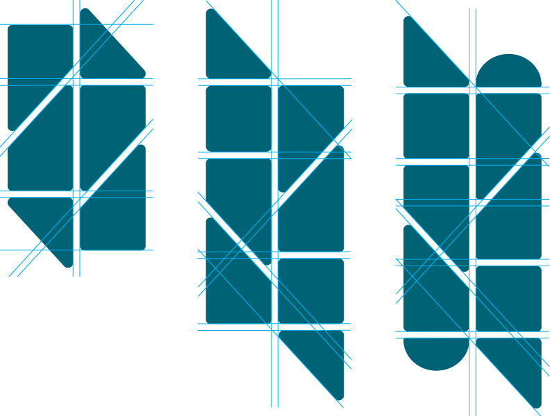
The multi-shape pattern is a combination of 2-4 varying shapes and is applied like a watermark over imagery, using all white at 30% opacity or 70% tint of a color. See Design Examples.
The following are approved shapes that can be used in the multi-shape pattern:

Colorful Triangle Pattern

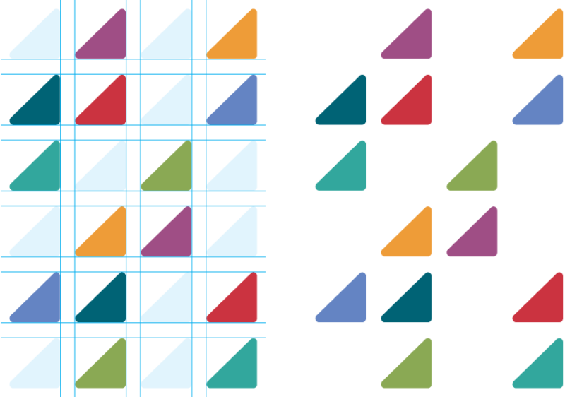
The colorful triangle pattern can be used to highlight a title or object, such as an image. It is a great way to introduce secondary and neutral color palettes into a design. See Design Examples.
- Colors should be from the lighter secondary and neutral palettes, and include at least one of the primary colors. The colors can be randomized as long as no one color dominates over the others.
- Triangles and open spaces can be randomized, but make sure they are built on a grid
- All triangles should be the same size and oriented as show here.