Typography & Usage
Typography
Typography plays an important role in the identity of our brand and is critical to creating effective communication that is visually uniform. When used consistently, type can help to build the character of a brand.
There are three font families used to support the brand: Lexia, Altform and Noto Sans. They each have a modern basic form with high functionality across systems making for information that is crisp, clear and distinct across all organizational materials.
Lexia

TITLES & HEADLINES
Lexia may be used interchangeably with Altform for titles and headlines. Since Lexia is not a free font, Noto Sans may be used as a fallback option only if both Lexia and Altform are not available.

Altform

TITLES & HEADLINES
Altform may be used interchangeably with Lexia for titles and headlines. Since Altform is not a free font, Noto Sans may be used as a fallback option only if both Lexia and Altform are not available.

Noto Sans

BODY COPY
Noto Sans should be used for all body copy. In some instances it may also be used as a fallback option for titles and headlines only when access to Lexia and Altform is not available.

Typographic Usage
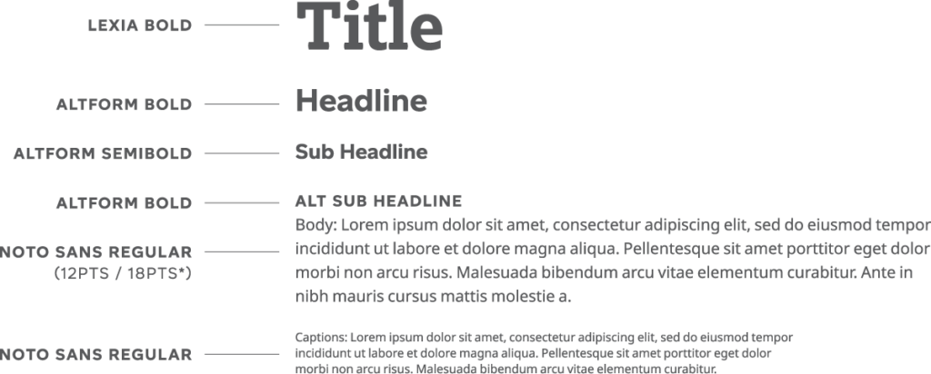
The example below shows a general guide to typographic hierarchy. When using black for copy — use at 80% tint.

*Recommended body copy size is 12pts/18pts for optimal readability.